Color Theory Fact Check: Does Mixing Pink and Green Always Result in Brown?
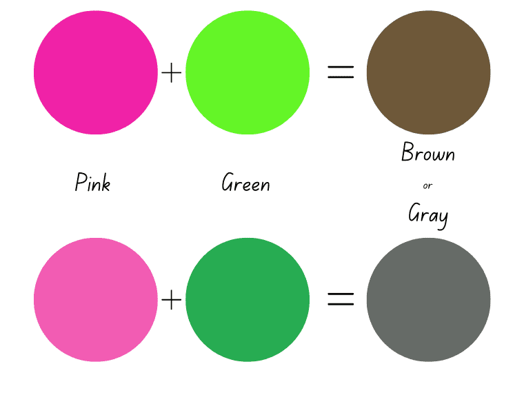
Squeeze cadmium green and crimson into a shared puddle on a palette, and you will produce a dark, unyielding sludge. Repeat the experiment with bubblegum pink and mint green, however, and the paint behaves entirely differently. Instead of sewage brown, the palette yields soft taupe, muted dove gray, or dusty olive.
The widespread belief that mixing any version of green and red-family pigments creates repulsive mud ignores basic chemical realities. Pink is not simply a distinct standalone wavelength; it is a high-value tint of red saturated with white. That single addition of white pigment alters how light reflects off the combined medium. Understanding how these pigments interact resolves a common painter's frustration and unlocks subtle neutral tones that pre-mixed tubes cannot replicate. As researchers noted in a recent Verywell Mind Report examining visual perception and color psychology, human reactions to tints like pink hinge on their balance of warmth, luminosity, and contextual contrast.
📌 Key Takeaways:
- Core Result: Mixing pink and green yields muted neutrals, ranging from soft taupe undertones and warm khaki to cool slate and neutral gray shades, rather than pure dark brown.
- The Chemical Driver: Pink introduces titanium or zinc white into subtractive color mixing, preventing complementary wavelengths from collapsing into dense, murky darks.
- Temperature Controls Hue: Pairing cool emerald with cool baby pink generates clean silver-grays, while warm sap green combined with coral pink produces warm olive brown hues.
The Complementary Trap: Why Red and Green Cancel Out
Classic color wheel theory places red and green directly opposite one another at 180-degree angles. They are true complementary colors. In subtractive color mixing, the physics governing physical matter like paints, inks, and textile dyes, pigments absorb specific bands of visible light and reflect what remains back to the human eye.
A pure red pigment absorbs green and blue wavelengths, reflecting primarily red. A balanced green pigment absorbs red wavelengths, reflecting green and blue. When combined in equal measures, these pigments cancel each other's reflective capabilities across the spectrum. The mixture absorbs nearly all visible wavelengths between 400 and 700 nanometers. The resulting optical perception is a dark, chromatic neutral: deep brown, charcoal, or near-black.
Muddy mixtures occur when painters combine pigments without accounting for their absorption profiles. Pure primaries on a traditional artist's wheel rarely behave like laboratory wavelengths. Most store-bought tubes contain secondary staining compounds and carrier binders that muddy quickly if forced into direct complementary opposition.
Deconstructing Pink: The White Pigment Variable
Pink breaks the complementary trap because it is fundamentally a tint, not a raw spectral hue. True pink is red diluted with high-opacity white pigment, typically titanium dioxide or zinc oxide.
White pigments do not selectively subtract visible light wavelengths. Instead, they scatter light uniformly across the visible spectrum. When you introduce white into an acrylic paint blending session, you raise the value (lightness) and diminish the chroma (saturation) of the red base.
Physical Red Pigment + White Pigment (TiO₂) = Pink (High-Value Red Tint)
Pink (Scatters Light) + Green (Absorbs Red) = Desaturated Neutral / Taupe / Slate
Because white scatters incoming photons before the red and green particles can fully absorb them, the resulting blend cannot drop into the low-value, pitch-dark zone that produces deep sludge. Instead of collapsing into a heavy dark mass, the interaction produces a luminous neutral. Depending on your base hues, you produce heather grays, mushroom taupes, and soft putty tones.
Pigment Ratios and Resulting Spectral Outputs
The precise color you achieve depends on three factors: volumetric ratios, the underlying temperature of the components, and the opacity of the base binders.
A heavy bias toward green yields muted moss and sage variants. Shifting the weight toward pink creates dusty rose, mauve, or warm linen. Modifying the proportion of white within the pink dictates whether the mix turns into a deep olive-khaki or a pale French gray.
| Pigment Blend Ratio | Underlying Base Tones | Resulting Hue & Undertone | Practical Design Application |
|---|---|---|---|
| 70% Pink / 30% Green | Plaster Pink + Forest Green | Muted Taupe / Dusty Rose-Beige | Warm interior drywall tints; portrait skin shadow transitions |
| 50% Pink / 50% Green | Magenta-tinted Pink + Phthalo Green | Neutral Gray / Weathered Pewter | Atmospheric landscape fog; industrial cast concrete finishes |
| 30% Pink / 70% Green | Salmon Pink + Sap Green | Olive Brown / Earthy Khaki | Botanical foliage shading; exterior architectural joinery |
| 80% White-Heavy Pink / 20% Emerald | Titanium Blush + Blue-leaning Emerald | Cool Alabaster / Sea-Mist Gray | Restful bedroom ceiling flats; ceramic glazes |

Additive Light Versus Subtractive Paint Blending
The rules governing physical paint do not apply to digital screens, stage illumination, or human photoreceptor response in free space. The outcome shifts dramatically depending on whether you operate under additive or subtractive systems.
Subtractive mixing involves matter. Pigments absorb light, meaning every added drop of paint subtracts available reflected wavelengths from your eyes. As demonstrated, pink paint and green paint combine to create low-saturation neutrals, taupes, and olive drabs.
Additive mixing involves direct light sources. Computer displays and theatrical spotlights operate through red, green, and blue (RGB) light channels that stimulate retinal cones directly. In this system:
- Pink light is produced by maximizing the red channel while adding moderate amounts of blue and green light (e.g., RGB values around `255, 182, 193`).
- Pure green light projects direct photons exclusively along the 520, 550 nanometer spectrum (e.g., RGB `0, 255, 0`).
- Superimposing these two light beams onto a screen adds their radiant energies together instead of canceling them out.
When pink and green beams intersect, the green photons blend with the red and blue components of the pink light. Because red light combined with green light yields yellow light, the overlap creates a radiant, pale cream or desaturated yellow-white. It never turns gray, brown, or khaki.
Color Temperature Dynamics: Emerald, Sage, and Plaster Tones
Color temperature dictates whether a physical mixture lands as a clean architectural neutral or a muddied earth pigment. Green and pink both possess warm and cool variations, determined by secondary color biases.
Green can lean warm (yellow-dominant, such as olive, moss, and sap green) or cool (blue-dominant, such as viridian, mint, and emerald). Pink can lean warm (yellow-dominant, such as peach, coral, and salmon) or cool (blue-dominant, such as magenta, fuchsia, and orchid).
When interior designers pair emerald green and plaster pink in living spaces, they rely on simultaneous contrast. As design commentators at Real Simple and Homes & Gardens noted in their 2026 home palettes coverage, placing high-saturation jewel greens adjacent to low-saturation chalk pinks creates visual tension without eye fatigue. The eye reads the pairing as sophisticated because the two shades complement each other without competing for the same visual frequency.
Blending those two specific pigments directly on a palette yields an entirely different harmony. A cool, blue-biased emerald mixed with a cool, blue-biased plaster pink creates a quiet, silvery slate. The blues in both pigments reinforce one another, producing a refined gray.
Conversely, combine a warm sap green with a warm coral pink, and the hidden yellow undertones dominate the reaction. The mix pivots immediately into rich olive brown hues and deep umber tones.
How Artists Neutralize Color Without Carbon Black
Relying on tube black (carbon black or ivory black) to darken or desaturate a vibrant color often ruins a composition. Pure black flattens paintings, deadens surrounding chromatic energy, and drains the vibrancy from biological subjects like skin, foliage, and fabric.
Professional painters use complementary balancing to lower a color's saturation naturally. If an artist finds an emerald green passage in an oil painting too sharp or artificial, introducing a drop of carbon black turns it into a dull, lifeless slate.
Introducing a pale, red-based pink instead alters the green's tint and shade balance naturally:
- The red wavelengths neutralize the overwhelming green chroma.
- The white pigment maintains luminosity across the brushstroke.
- The combined mix produces a natural shadow tone that feels organically tied to the broader lighting conditions of the scene.
This dynamic also explains why botanical illustrators rely heavily on pink-green mixtures. Stems, leaf veins, and blossom bases rarely present as raw primary greens; they carry subtle brownish-pink sheaths that only direct complementary blending can capture accurately.
Frequently Asked Questions (FAQ)
Q1: Will mixing pink and green paint ever make pure brown?
A1: Rarely. Pure brown requires saturated red, yellow, and blue (or balanced red and dark green) without substantial white. Because pink contains a high volume of white pigment, the resulting mixture will almost always sit in the lighter neutral family: taupe, muted khaki, or soft dove gray.
Q2: Why did my pink and green watercolor blend turn into dirty sludge?
A2: Watercolor pigments are transparent rather than opaque. If you use a granulating green made from multiple lower-grade pigment compounds and blend it with a heavily dyed red wash, the overlapping particles absorb light unevenly across the paper fibers, creating a visual effect that reads as muddy rather than smoothly neutralized.
Q3: How do I create a modern French gray using pink and green?
A3: Start with a cool, high-tint baby pink that uses titanium white and quinacridone magenta. Slowly fold in tiny increments of cool viridian or phthalo green. The blue undertones in both pigments will cancel the warm red-yellow spectrum, yielding a clean, architectural silver-gray.
Mastering the Palette Beyond the Mud Myth
The assumption that complementary colors always collapse into visual sludge stems from a misunderstanding of how pigments function outside the classroom wheel. Subtractive color mixing is not a blunt, binary process. Pigment ratios, underlying binders, and internal temperatures dictate the final swatch.
Pink alters the equation entirely. By carrying white pigment directly into the mix, it prevents complementary red and green wavelengths from completely extinguishing reflected light.
Instead of an unwanted mud puddle, mixing pink and green offers a fast track to sophisticated neutrals. Master the ratio, regulate the temperature, and the combination becomes an indispensable tool for painting, design, and practical color correction.