The Ultimate Purple Mixing Masterclass: Pigment Formulas, Ratios, and FAQs
Elementary art classes taught generations of painters an oversimplified lie: mix red and blue to make purple. Anyone who squeezed Cadmium Red and Phthalo Blue onto a palette quickly discovered the disappointing result, a murky, sludge-like brown that looked closer to river silt than regal amethyst. Understanding how to create luminous, vibrant purples across paint, textiles, and digital design requires unlearning grade-school axioms and examining the mechanics of subtractive color theory. Controlling pigment bias is essential everywhere from studio fine arts to cosmetic formulation, a dynamic underscored in a recent Vogue Report on precision tonal balancing and neutralizing brassy undertones. Even nature treats the hue with extreme chemical specificity; as The Times of India highlighted in February 2026 regarding the mystery of rare purple honey, producing true violet tones in physical matter demands exceptional organic and mineral balances.
To produce a purple that sings rather than sinks into gray, you must manage warm versus cool undertones, understand spectral wavelengths, and select single-pigment colors designed to harmonize.
📌 Key Takeaways:
- The Root Problem: Traditional red and blue paints carry yellow undertones, inadvertently creating a three-primary mix that generates dull brown sludge.
- The Ideal Palette Pairing: Combining Quinacridone Magenta (PR122 or PV19) with Ultramarine Blue (PB29) produces the cleanest, most luminous violet available in physical pigments.
- The Subtractive Reality: The secondary color wheel operates cleanly under Cyan, Magenta, and Yellow (CMY), making modern printing primaries far superior to historical red-yellow-blue (RYB) standards.
The Primary Myth and the Physics of Pigment Bias
Every tube of commercial paint contains chemical pigments with inherent warm or cool undertones. Pigments do not emit light; they subtract it. When sunlight hits a painted surface, the pigment absorbs specific wavelengths and reflects the remainder back to the eye.
The standard red-yellow-blue model fails because most classic red paints, such as Cadmium Red Medium, carry an orange bias. Orange contains yellow. In subtractive color theory, combining all three primary colors, red, blue, and yellow, yields brown or neutral dark gray. When you blend a warm, yellow-leaning red with blue, you are not mixing two colors. You are mixing three. The trace presence of yellow contaminates the spectrum, dropping color saturation and tinting your mixture toward olive or muddy mud.
To avoid muddy purple, artists turn to modern pigment classifications. Replacing yellow-biased reds with cool, blue-leaning reds shifts the equation entirely. In professional acrylic paint mixing, the cleanest violets emerge when both components share a common blue wavelength, completely barring yellow from the mix.
The Exact Pigment Formulas for Radiant Violets and Deep Plums
Vibrant secondary colors require specific single-pigment paints rather than pre-mixed student formulations. Professional artists rely on distinct formulas to generate predictable, highly saturated purples across the tonal spectrum.
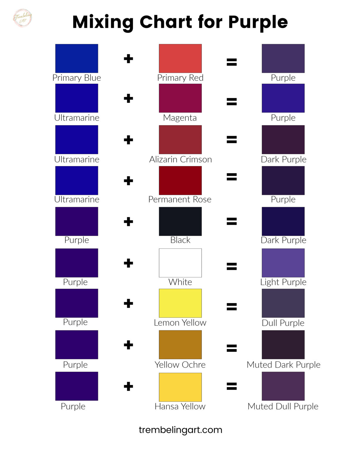
For the most brilliant, clean violet, combine Quinacridone Magenta (PR122) with Ultramarine Blue (PB29). Quinacridone Magenta is a cool red that sits near the violet threshold on the secondary color wheel. Ultramarine Blue is naturally warm and reddish, containing red undertones rather than yellow or green. When these two pigments meet, their light-absorption profiles align without third-color interference. A baseline ratio of 3 parts Quinacridone Magenta to 1 part Ultramarine Blue creates a balanced royal purple. Adjusting the ratio to 4:1 produces rich magenta-violet, while reversing it to 1:2 yields an intense, deep indigo.
For deep, moody, jewel-toned plums, swap Ultramarine Blue for Phthalo Blue (Red Shade, PB15:6) paired with Alizarin Crimson (PR83) or Dioxazine Violet (PV23). Phthalo pigments possess immense tinting strength; adding a pinhead amount instantly overtakes weaker reds. Proceed cautiously by mixing red into blue in micro-increments rather than pouring blue directly into your red base.
Empirical Mixing Matrix: Pigment Combinations Compared
Selecting paint combinations without checking pigment index numbers on the tube leads to inconsistent results. The following table breaks down empirical outcomes using standard acrylic and oil pigment grades.
| Primary Red / Magenta | Primary Blue / Cyan | Optimal Ratio | Visual Outcome | Saturation Integrity |
|---|---|---|---|---|
| Quinacridone Magenta (PR122) | Ultramarine Blue (PB29) | 60% Red : 40% Blue | Luminous Royal Violet | Exceptional (No Mud) |
| Cadmium Red Medium (PR108) | Ultramarine Blue (PB29) | 50% Red : 50% Blue | Muted Raisin / Rust Brown | Low (Yellow Interference) |
| Primary Magenta (PR122) | Primary Cyan (PB15:3) | 70% Red : 30% Blue | Vivid Electric Purple | Maximum Chroma |
| Alizarin Crimson (PR83) | Phthalo Blue (PB15:1) | 85% Red : 15% Blue | Deep Midnight Aubergine | High (Dark Jewel Tone) |
| Naphthol Crimson (PR170) | Cerulean Blue (PB35) | 50% Red : 50% Blue | Chalky Slate Mauve | Moderate to Low |

Why Modern Color Systems Rely on Cyan and Magenta
Modern industrial printing and textile manufacturing abandoned the historical red-yellow-blue primary model decades ago. Commercial lithography and textile dyeing use the CMYK model (Cyan, Magenta, Yellow, Key/Black) because it matches the physiological mechanics of human photoreceptors far more precisely.
Red is not a pure subtractive primary; it is a secondary color created by reflecting both red and yellow light while absorbing green. When you mix red paint, you bring absorbed green wavelengths along with it. Magenta, by contrast, absorbs only green light while reflecting red and blue across the spectrum. Cyan absorbs exclusively red light while reflecting green and blue.
When you execute cyan and magenta mixing, the pigments cancel out green and red wavelengths cleanly, leaving only the blue-violet spectrum visible. If maximum vibrancy is your objective, buy paints labeled Process Magenta and Process Cyan instead of Cadmium Red and French Ultramarine. This shift delivers an electric violet that historical palettes simply cannot replicate.
From Lavender to Aubergine: Mastering Tints, Tones, and Shades
Mixing the core hue is only the initial step. Adjusting lightness, saturation, and depth requires disciplined tinting techniques. Adding the wrong white or black can quickly flatten a dimensional purple into dull, opaque paste.
To produce delicate shades of lavender and violet, use Zinc White (PW4) rather than Titanium White (PW6). Titanium White is dense, chalky, and aggressively opaque, muting chromatic intensity within seconds. Zinc White, which is transparent and has low tinting strength, lifts values into soft lilac, wisteria, and lavender while keeping the underlying saturation vibrant.
When engineering deep jewel tones, completely avoid Carbon Black or Mars Black. Adding black paint drains saturation immediately, pushing vibrant purple into dingy charcoal. Instead, darken your mix using complementary color theory: introduce a tiny stroke of Raw Umber (PBr7) or combine Ultramarine Blue with Burnt Sienna (PBr7). These earth pigments lower the value into rich boysenberry, eggplant, and midnight violet without sacrificing warmth or chromatic complexity.
Cross-Medium Translation: Dyes, Inks, and Digital Screens
Color theory rules apply differently depending on whether your work involves reflective pigments, fiber-reactive chemical dyes, or emissive pixels.
In textile design, mixing liquid dyes on protein fibers like silk or cellulose fibers like cotton requires calculating fiber porosity and pH balance. Natural indigo paired with cochineal yields historic purples, but synthetic fiber-reactive Procion MX dyes require MX-8B (Magenta) and MX-G (Turquoise) to prevent salt bath precipitation from muddying the fabric. Protein fibers require acidic fixing baths around pH 4.5, while cellulose cottons require alkaline soda ash environments at pH 10.5 to set the violet chromophores permanently.
For digital artists working in RGB color spaces, mixing purple flips from subtractive absorption to additive projection. Purple light forms by exciting red and blue sub-pixels at specific digital intensities. A balanced royal purple operates at HEX #7851A9 (Red 120, Green 81, Blue 169). Pushing into vivid neon violet requires maxing blue while maintaining moderate red drive: HEX #8A2BE2 (Red 138, Green 43, Blue 226). In additive workflows, green represents the contamination risk; boosting the green digital channel past 30% desaturates violet into gray.
Frequently Asked Questions (FAQ)
Q1: Why does my purple paint look brown after it dries on the canvas?
A1: Acrylic paints darken by 10% to 20% during drying as the polymer binder shifts from milky white to transparent. If your original mix contained trace amounts of yellow or orange pigment (such as Cadmium Red), that hidden warm undertone reveals itself as the binder clarifies, leaving behind a dull, brownish cast.
Q2: Can I mix purple using food coloring or liquid dyes?
A2: Yes, but avoid standard grocery-store red dye, which contains yellow food additives to simulate cherry or strawberry tones. Use neon pink or magenta food colorings paired with standard sky blue. A ratio of 3 drops pink to 1 drop blue produces clean violet without brackish sediment.
Q3: What single pigment can I buy if I do not want to mix purple manually?
A3: Purchase Dioxazine Violet (PV23). It is the darkest, most saturated single-pigment violet manufactured for commercial use. It offers immense tinting power and works cleanly as a pure primary base that you can warm up with Quinacridone Magenta or cool down with Ultramarine Blue.
Developing Technical Control Over Modern Color Palettes
Mastering color mixing requires looking beyond generic label names on paint tubes. The path to clean, predictable purples begins with inspecting the fine print for Pigment Index codes like PR122 and PB29 rather than trusting commercial marketing names. By systematically eliminating yellow undertones, controlling tinting agents with transparent whites, and respecting the subtractive mechanics of magenta and cyan, artists and designers can move past frustrating trial-and-error mixing to produce brilliant, repeatable violets with confidence.