Color Formula Breakdown: Visual Ratios to Mix Every Trending Shade of Purple
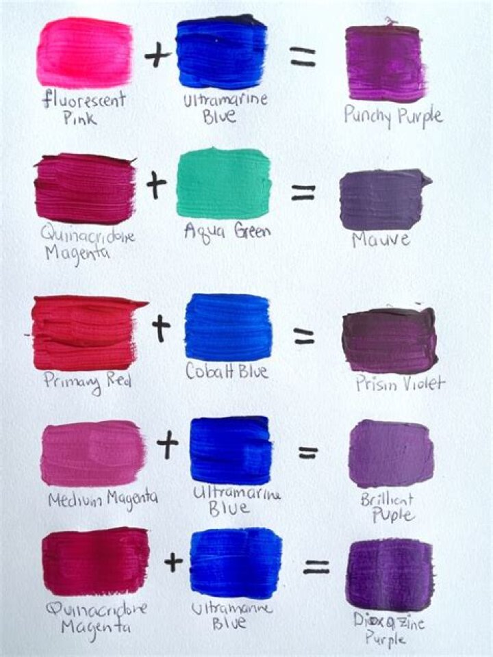
Autumn 2026 design collections and runway forecasts have pushed jewel tones back into high demand. The latest Who What Wear Report identified royal purple as an essential shade defining the season alongside aqua blue and chilli red, while shelter magazines like Veranda spotlighted designer-approved deep violet interiors. Even materials science has entered the fray: research published in August 2026 highlighted a structural purple fabric engineered to reflect solar heat and stay up to 6.2°C cooler than standard textiles. Yet, when painters and decorators attempt to mix this shade in their studios, they frequently hit a frustrating wall: sludgy, desaturated mud.
Mixing a clean purple seems simple when taught through elementary school color wheels, where blue and red yield purple. In reality, working with physical acrylics, oils, or gouache requires understanding pigment chemistry, bias, and spectral absorption. Mastering exact color mixing ratios eliminates guesswork, turning amateur paint blends into crisp, intentional shades that range from rich plum to regal purple.
📌 Key Takeaways:
- The Core Flaw: Combining warm reds like cadmium red with blue introduces yellow wavelengths, neutralizing the blend into brown or gray.
- The Essential Pigments: Crisp regal purple shades require cool primary color pigments, specifically quinacridone magenta or process cyan combined with ultramarine blue.
- Value Control: Tinting with titanium white cools and desaturates purple into pastel lilac, while zinc white retains chromatic vibrancy.
The Pigment Bias Behind Muddy Paint and Failed Blends
Every tube of commercial artist paint contains specific chemical pigments that lean toward either a warm or cool bias on the color theory wheel. When a mix turns into an unappealing brown instead of vibrant violet, warm vs cool undertones are almost always the culprit. Avoiding muddy paint requires identifying which secondary wavelengths are hiding inside your primary paints.
Traditional cadmium red carries a strong orange-yellow bias. When mixed with ultramarine blue, a blue that leans slightly warm with red undertones, the tiny fraction of yellow in the cadmium red forms a hidden three-part mixture: blue, red, and yellow. In subtractive color theory, mixing all three primaries in uneven amounts creates tertiary neutrality: drab brown. To preserve brilliance, you must eliminate yellow from the equation entirely.
The solution rests in selecting cool reds. Cool reds lean toward blue on the spectrum and contain zero yellow bias. Tubes labeled quinacridone magenta (pigment PR122 or PV19), primary magenta, or alizarin crimson yield pure, luminous violets when blended with blue. Checking the pigment code printed on the tube prevents costly ruined batches before a single stroke touches the palette.
The Physics of Primary Color Pigments on the Color Theory Wheel
Subtractive color mixing works by absorbing (subtracting) specific wavelengths of visible light and reflecting the rest into the eye. Blue pigments absorb red and green light, reflecting blue. Red pigments absorb green and blue light, reflecting red. When both are combined, only violet wavelengths escape absorption.
If either tube contains impurities or broad-spectrum fillers, less light bounces back. The result is optical dullness. Ultramarine blue (PB29) serves as the industry standard for mixing royal purple because its crystalline aluminosilicate structure naturally reflects both blue and deep red wavelengths. Pairing it with quinacridone magenta produces an energetic secondary color that maintains high saturation across both dark and medium values.
Conversely, pairing phthalocyanine blue (PB15:3) with magenta creates an intense, ink-dark violet that borders on navy. Phthalo pigments possess immense tinting strength; adding just a pinhead drop will rapidly overpower equal parts of red. Managing these chemical strengths is the secret to repeatable, consistent studio results.
Visual Ratios to Mix Every Trending Shade of Purple
Replicating specific hues demands precise volumetric proportions rather than casual estimation. The table below outlines field-tested pigment ratios for five dominant purple variants using heavy-body acrylic paint mixing techniques.
| Target Hue | Base Pigments | Volumetric Ratio | Modifying Agent |
|---|---|---|---|
| Royal Purple | Ultramarine Blue + Quinacridone Magenta | 50% Blue : 50% Magenta | None (Pure mass-tone) |
| Rich Plum | Quinacridone Magenta + Ultramarine + Burnt Umber | 60% Magenta : 30% Blue : 10% Umber | Warm brown earth tone |
| Soft Lilac | Titanium White + Magenta + Ultramarine | 85% White : 10% Magenta : 5% Blue | High-opacity white base |
| Deep Eggplant | Dioxazine Purple + Phthalo Blue + Burnt Sienna | 50% Violet : 35% Blue : 15% Sienna | Iron oxide red-brown |
| Electric Violet | Cobalt Blue + Quinacridone Magenta | 40% Blue : 60% Magenta | Trace Zinc White ( |
Controlling Value and Desaturation with Titanium White
Lightening a purple mixture without flattening its depth requires careful white selection. Tinting with titanium white (PW6) offers maximum hiding power and opacity. Because titanium white is exceptionally opaque and slightly chalky, dumping it directly into a deep violet mix rapidly turns the paint into a milky lavender. The color cools down rapidly as the white pigment scatters shorter blue wavelengths across the surface.
When working on botanical studies, portrait undertones, or glazed decor where luminosity matters, professional painters swap titanium white for zinc white (PW4). Zinc white provides approximately one-tenth the tinting strength of titanium white. It lifts the color value incrementally, allowing artists to preserve the fiery red flash inside quinacridone magenta without triggering instant opacity.
For DIY decorators mixing sample pots for accent walls, always mix paints from light to dark. Start with your white base on the palette, then fold in millimeter-sized dabs of your mixed purple concentrate. Building value upward prevents accidental pigment waste, saving expensive artist pigments from being diluted by gallons of corrective white.
Acrylic Paint Mixing: Managing the Dreaded Dry-Down Shift
A frequent trap in DIY acrylic paint projects is the dry-down color shift. Wet acrylic emulsion contains liquid polymer binders that appear milky-white when wet. As the water evaporates, the polymer turns completely transparent, exposing the pure pigment underneath. Consequently, acrylic paints consistently dry 10% to 20% darker than they look while wet on the palette.
When formulating soft lilac or muted thistle shades, mix the wet paint roughly one step lighter and slightly more vibrant than your target sample swatch. Test the blend on a piece of scrap cardstock and dry it with a household hair dryer for 60 seconds before coating large surfaces. This simple check eliminates mismatched wall patches and uneven canvas repairs.
Additionally, monitor paint viscosity. Blending heavy-body acrylics with soft fluid mediums can alter how pigments sit against each other. Keep moisture consistent throughout mixing sessions to ensure smooth, streak-free color distribution.
Frequently Asked Questions (FAQ)
Q1: Why does my purple turn into gray-brown even when using artist-grade paint?
A1: Your red paint likely carries a warm cadmium red bias containing trace yellow pigments. Yellow and purple sit directly opposite each other on the color wheel and act as complementary neutralizers. Switch your red component to quinacridone magenta, permanent rose, or primary magenta to remove yellow wavelengths entirely.
Q2: Can I mix purple using black paint to darken it into eggplant?
A2: Avoid adding straight carbon or ivory black to purple. Carbon black carries a cool, blue-gray bias that creates a deadened, chalky tone. To darken purple into a rich, deep plum or eggplant, introduce burnt umber or raw umber alongside a touch of ultramarine blue. This deepens the value while maintaining chromatic warmth.
Q3: How do I mix a warm violet versus a cool violet?
A3: Adjust the baseline ratio between your blue and magenta. A warm violet requires a 2:1 ratio of magenta to blue, pushing the shade toward orchid and wine. A cool violet requires a 2:1 ratio of ultramarine or cobalt blue to magenta, driving the tone closer to indigo and periwinkle.
Precision Pigment Control for Modern Studios
Mastering color mixing relies on chemical discipline rather than creative chance. The surge of deep purple across fashion houses, interior design collections, and functional textile engineering in late 2026 confirms that rich chromatic palettes are reclaiming the spotlight. Achieving these regal shades on canvas or home decor surfaces requires casting aside simplified primary rules in favor of true pigment awareness.
By swapping warm reds for cool quinacridone tones, balancing ultramarine's natural red cast, and managing opacity through deliberate white selection, creators maintain absolute authority over saturation and value. Precise ratios yield clean, striking results every single time.