From Hot Metal to Pixel Perfection: The Evolution and Modern Redesigns of NYT Typography
Every morning, millions of readers open a newspaper or tap an app screen without realizing that decades of industrial design dictate how their brains process reality. As highlighted in recent coverage from The New York Times Report, visual heritage and brand architecture shape public trust in ways consumer brands continually attempt to emulate. For The New York Times, typography represents far more than an aesthetic preference; it serves as a structural foundation engineered to survive ink bleed, digital compression, and shifting editorial mandates.
The visual signature of the Gray Lady relies on an intricate, multi-tiered hierarchy rather than a single typeface. From the instantly recognizable blackletter masthead down to the micro-tuned digital serif that renders news briefs on mobile displays, this typographic ecosystem balances nineteenth-century print authority against the brutal constraints of responsive web code.
📌 Key Takeaways:
- The Core Ensemble: The paper operates on a coordinated system led by custom cuts of NYT Cheltenham for headlines, Imperial and custom serifs for print body text, and digital adaptations like Georgia and custom cuts for web reading.
- Custom Engineering: Rather than relying on commercial desktop fonts, the company commissions proprietary revisions from typographers like Matthew Carter to preserve ink-traps on paper and pixel alignment on retina screens.
- The 2026 Shift: Modern layout overhauls, especially the magazine's first redesign in a decade, systematically integrate flexible variable fonts to unify print editions with complex digital reading apps.
The Century-Long Architecture of Headline Authority
The quest to find an official font for New York Times layouts begins with a fundamental misunderstanding. Readers often assume the paper buys off-the-shelf fonts. In truth, the publication runs on bespoke type programs built to solve specific mechanical bottlenecks.
The newspaper headline fonts that define the front page owe their presence to Bertram Grosvenor Goodhue, who designed Cheltenham at the turn of the twentieth century. Originally cut by the American Type Founders, Cheltenham offered tall ascenders and compact proportions that allowed editors to squeeze high-character-count headlines into narrow broadsheet columns without sacrificing visual gravity.
By 2003, the print paper suffered from visual drift. Dozens of mismatched cuts had accumulated across departments. Design director Tom Bodkin commissioned legendary type designer Matthew Carter to overhaul the entire suite. Carter synthesized the sprawl into NYT Cheltenham, an expansive custom editorial typography family spanning over 60 weights and widths. Carter added subtle asymmetric serifs and calculated weight distributions that prevent headlines from appearing bloated when set in heavy ink on rapid rotary presses.
Alongside Cheltenham sits the Karnak font family, designed by Ludlow typographer R. Hunter Middleton in the 1930s. Karnak, an Egyptian slab-serif with razor-sharp horizontal terminals, became the distinct signature of the Arts and Leisure section and continues to provide punchy structural accents across both print inserts and weekend cultural features.
From Linotype Slugs to Screen Pixels: Print Body Evolution
Body copy presents an entirely different set of physical hurdles. For decades, print body text typefaces were defined by the Imperial typeface, created in the 1950s by Edwin W. Shaar for the Intertype Corporation. Imperial was drawn specifically to endure the brutal physics of hot-metal typesetting, high-speed stereotyping cylinders, and porous newsprint. It featured wide counters, stubby serifs, and open apertures that stopped cheap ink from pooling inside closed letterforms like "e" and "a".
When the publishing industry pivoted to desktop publishing and online distribution, Imperial struggled. Its proportions looked harsh on low-resolution monochrome CRT monitors and primitive LCD panels. The organization temporarily turned to standard web-safe staples, deploying the Georgia font, engineered by Carter for Microsoft in 1993, to handle longform digital reading.
Georgia succeeded because Carter designed it directly on a screen pixel grid before translating it to outlines. But as device resolutions leaped past 300 pixels per inch on modern smartphones, the digital news typography system demanded proprietary refinement. The paper transitioned to custom digital serifs (collectively recognized internally as NYT Imperial and later NYT Roman), sharpening stroke contrast and reclaiming the refined editorial cadence that screen-optimized fonts had historically ironed out.
Typographic Benchmarks Across Print and Digital Platforms
Tracking the functional components across a century of publishing shows how mechanical utility drove visual design choices at every critical junction.
| Typography Role | Primary Face / Family | Designer & Origin | Primary Functional Purpose |
|---|---|---|---|
| Masthead Logo | Custom Blackletter Fraktur | Historical Hand-Lettering (Refined 1967) | Institutional continuity and legal identity. |
| News Headlines | NYT Cheltenham | B.G. Goodhue / Matthew Carter (2003) | High character density in narrow vertical columns. |
| Print Body Text | Imperial (NYT Imperial) | Edwin W. Shaar (1954) / Modern In-House | Resistance to ink pooling on high-speed porous paper. |
| Digital Longform | NYT Roman / Georgia / NYT Franklin | Carter, Morris Fuller Benton, Modern Foundries | Sub-pixel rasterization and rapid DOM rendering. |
| Display & Cultural | Karnak & Custom Sans | R. Hunter Middleton (1930s, Present) | Tonal contrast for features, arts, and lifestyle sections. |
The Blackletter Masthead: Anatomy of an Unchanging Nameplate
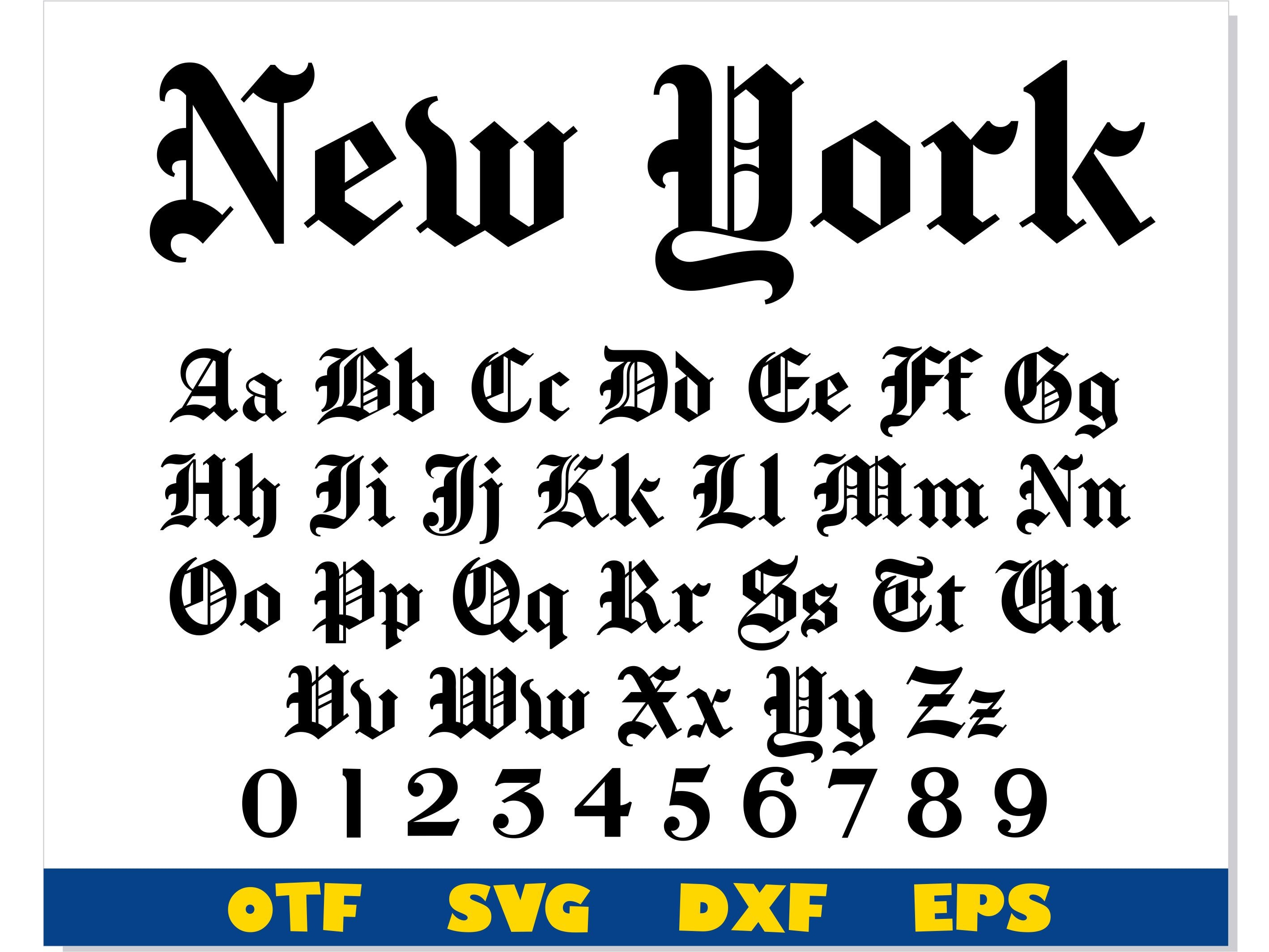
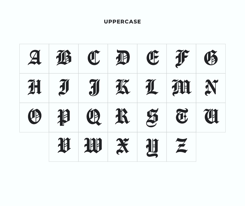
The iconic blackletter masthead at the top of page one is not a font at all. It is a locked piece of drawn lettering rooted in nineteenth-century German Fraktur and English Text traditions.
Publishers in the 1850s adopted heavy gothic letterforms because they projected moral seriousness, scholarly authority, and religious solemnity. While competitor broadsheets gradually shifted toward cleaner neoclassical or geometric serifs, the Times stood firm. The modern mark is an exact, vector-preserved iteration of a 1967 refinement drawn by legendary book designer and typographer Edward Benguiat.
Benguiat made several microscopic adjustments that most readers never detected. He eliminated a clumsy ornamental drop-shadow inside the letter flourishes, shaved the hairline terminals to prevent ink buildup between the letters "N" and "e", and redrew the period at the end of the phrase. When the paper dropped the closing period from its masthead on February 21, 1967, readers mailed in thousands of letters protesting the missing dot. The controversy proved that a nameplate acts as a legal seal of authenticity rather than simple decoration.
The 2026 Magazine Redesign: Breaking Format Rules
The most adventurous visual experimentation happens far away from the daily news desks. In April 2026, the company launched the New York Times Magazine redesign, marking the weekly publication's first wholesale visual reinvention in ten years. As reported by design outlets like It's Nice That and confirmed directly in The Thinking Behind Our Times Magazine Redesign, the initiative overhauled the balance between longform literary reading and visual shock value.
Magazine design directors stepped away from static headline structures, embracing custom editorial typography engineered as variable font files. The magazine cuts downplay the rigid authority of Cheltenham in favor of experimental display faces that shift weight and optical axis dynamically depending on page orientation.
Print readers encountered expressive type choices that evoke editorial posters from the late 1960s, while web readers received lightweight CSS variable type packages that cut page-load times by 18% to 24% across content delivery networks. This redesign demonstrated that modern publication design must exist as software infrastructure, delivering high art on heavy coated paper while running cleanly across native iOS and Android environments.
Legal Realities and Custom Font Licensing
Design teams often ask how they can secure the font for New York Times design aesthetics in commercial client projects. The answer involves legal and technical barriers.
You cannot buy the exact NYT Cheltenham or NYT Imperial digital files. These fonts live under exclusive custom font licensing arrangements commissioned directly by The New York Times Company. Foundries like Carter & Cone and Monotype retain the underlying rights, while the Times holds worldwide exclusive digital execution rights for their custom weights.
For independent art directors and web developers, replicating this tone legally requires combining historic public-market equivalents:
- Headline Alternatives: Commercial cuts of ITC Cheltenham, especially Cheltenham Condensed Book and Bold, provide the base proportions of the front page.
- Body Reading: Bitstream Imperial, Minion Pro, or Georgia Pro offer similar open counters and sturdy serifs designed for continuous longform copy.
- Section Headers: Monotype's Stymie or commercial iterations of Karnak capture the bold mid-century slab-serif voice of Sunday sections.
Frequently Asked Questions (FAQ)
Q1: What is the exact headline font used on the front page of The New York Times?
A1: The front page headlines rely on NYT Cheltenham, a proprietary family of over 60 weights tailored by Matthew Carter in 2003 specifically for the newspaper's print columns and screen layouts.
Q2: Why does the digital website look different from the printed broadsheet?
A2: Newsprint absorbs liquid ink under physical pressure, requiring wide interior spaces and ink traps like those in Imperial. Mobile and desktop screens rely on sub-pixel rendering, where custom digital serifs like NYT Roman and sans-serifs like NYT Franklin minimize distortion on digital glass.
Q3: Can individual designers download or license the official NYT font files?
A3: No. The proprietary cuts are held under strict proprietary licenses. Commercial designers can achieve a comparable editorial feel by licensing standard editions of Cheltenham, Stymie, and Imperial through independent type foundries.
The Functional Future of Editorial Type
Publishing typography has moved past the era of fixed metal matrices and static digital outlines. The technical architecture behind editorial typefaces now operates as fluid responsive software. With variable fonts entering widespread production across publishing platforms, a single headline font file can seamlessly alter its stem weight, tracking, and optical size on the fly as a reader moves from a compact smartwatch notification to a full-sized 4K tablet spread.
The New York Times endures because its design leaders view typefaces as infrastructure, not window dressing. Good typography never screams for attention; it guides the reader through complex stories without creating visual friction. By uniting historic type design with strict software standards, the publication ensures that no matter where journalism appears, it carries the undeniable weight of the printed page.